Before You Choose Paint Colors, Read This Color Reality Truth

Before You Choose Paint Colors, Read This Color Reality Truth

Have you ever paused for a moment and wondered whether the color you are seeing is exactly the same color that another person is seeing?

At first, this question may sound philosophical or even unnecessary. After all, we all learn from childhood that colors are fixed—blue is blue, red is red, green is green. But when you observe real life carefully, you begin to notice something strange. The same color appears different under different lighting conditions, different screens, and even different people.

This confusion is not just imagination. It is a scientifically proven phenomenon known as color perception variation, and it has fascinated scientists, artists, architects, and designers for decades.

Read More : 100+ Maintenance-Free Home Construction Tips

One of the most famous examples that brought this discussion into the global spotlight was the viral image known as “The Dress.”

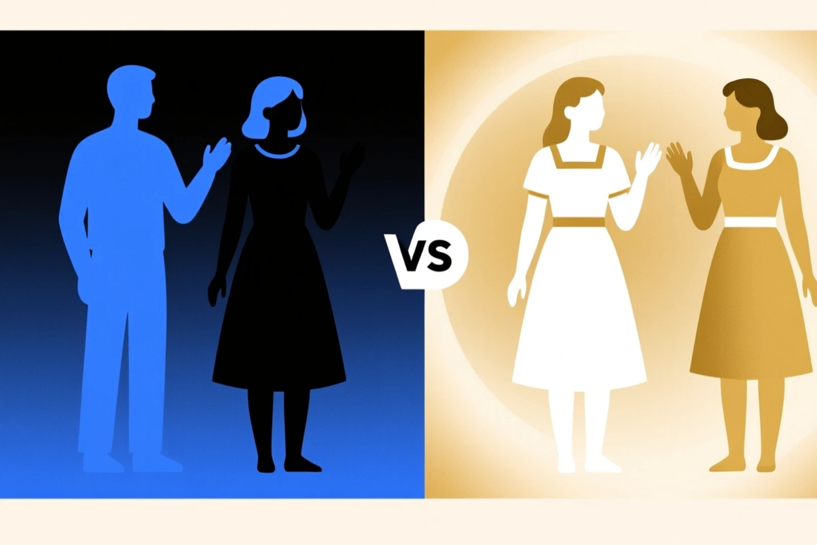
The Viral Mystery of “The Dress”

In 2015, a simple photograph of a dress became one of the most talked-about visual mysteries in internet history. The image divided people across the world into two strong groups. One group was absolutely certain that the dress was blue and black, while another group insisted it was white and gold. What made this phenomenon even more fascinating was not just the disagreement itself, but the confidence with which people defended what they saw. Friends argued, families debated, and social media platforms were filled with confusion over a single image that appeared to show two completely different realities.

Collage of a dress shown in four pairs of images, with each pair displaying the dress in two different color perceptions: gold and white on the left, and blue and black on the right, illustrating a popular optical illusion about the dress color.

Eventually, it was confirmed that the actual color of the dress was blue and black. However, the real mystery did not end there. The important question remained—how can the same image appear in two completely different ways to different people?

The Science Behind Color Perception

The answer lies in the way human vision actually works. When light reflects off any object, it enters our eyes in the form of wavelengths. These wavelengths are detected by specialized cells in the retina called cones, which are responsible for color vision. Humans typically have three types of cone cells that respond to red, green, and blue light. These signals are transmitted to the brain, which then interprets them and constructs the final image that we perceive as color.

Seamless pattern on black background featuring colorful ice cream cone icons inside red, blue, and green circles, interspersed with small silver thermometer icons in a grid arrangement.

This means a very important truth: we do not see objects directly as they are. Instead, we see a version of reality that is constructed by our brain based on light information. In other words, color is not an absolute property of an object, but a perception created inside the mind. 

Illustration showing a red wavy light wave labeled 650 nm directed at a stylized eye on a dark gradient background.

Why the Brain Gets Confused

The confusion seen in “The Dress” occurs because the human brain constantly tries to adjust for lighting conditions. It automatically makes assumptions about the environment in which an object is seen. If the brain assumes the image is in a shadow or dim lighting, it compensates by removing cooler tones, which can make the dress appear white and gold. On the other hand, if the brain assumes bright daylight, it subtracts warmer tones, leading to the perception of blue and black.

Dimly lit living room with a gray sectional sofa, a glass coffee table with books and a candle, and a sliding glass door leading to a balcony with outdoor chairs, illuminated by warm sunset light casting shadows on the wall and artwork above the sofa.

This process is known as color constancy, and while it helps us understand the world consistently in everyday life, it can also create powerful visual illusions when lighting cues are unclear or misleading.

Transparent 3D illustration of a human brain with blue and orange glowing neural connections inside, depicting brain activity on a white background

Read More : 100+ Maintenance-Free Home Construction Tips

The Qualia Problem – Why Perception Is Personal

Beyond science, there is also a deeper philosophical idea known as the qualia problem. This refers to the fact that each person experiences perception in a completely personal and internal way. Even if two people are looking at the exact same object, there is no way to directly compare how each person experiences that color in their mind. We can describe colors using language and measurements, but we cannot truly step inside another person’s perception.

Orange box with definition of Qualia as a philosophical term for individual, subjective conscious experiences, surrounded by colorful scribbles, question marks, eyes, and a magnifying glass illustration.

This raises a fascinating question—does everyone experience “blue” in the same way, or is each person’s version of blue slightly different?

Is Color Truly Universal?

Color perception is also influenced by language and culture. In some parts of the world, languages historically did not separate blue and green as distinct categories. Instead, both were described under a single term.

Solid vivid blue color background with subtle texture variations.

This shows that human perception is not purely biological, but also shaped by the way we learn, communicate, and interpret the world around us.

A man in a red shirt and blue jeans stands outdoors, balancing on a red and blue seesaw-like board on a tree stump, surrounded by fallen leaves with other tree stumps and playground equipment around.

The Architecture and Interior Design Challenge

For professionals such as architects and interior designers, this subject becomes especially important. A color chosen on a digital screen often behaves very differently in real environments. The same paint shade can appear bright and fresh in morning sunlight, muted in the afternoon, warm and rich in the evening, and completely different under artificial lighting.

Modern living room with a beige couch featuring brown cushions, flanked by a round wooden side table with a lamp on the left against a teal wall, and a square wooden side table with a lamp on the right against a blue wall, with a wooden coffee table in front and sunlight casting shadows across the room.

This happens because different light sources have different color temperatures, ranging from warm yellow tones to cool bluish-white tones. As a result, the same material can appear completely different depending on the lighting environment.

Read More : 100+ Maintenance-Free Home Construction Tips

Why Pink Does Not Exist in the Light Spectrum

One of the most surprising scientific facts about color is that pink does not exist as a wavelength in the visible light spectrum. Unlike red, blue, or green, pink is not a spectral color found in light. Instead, it is created by the brain when it combines specific visual information, particularly from red and violet or blue wavelengths.

Cartoon pink brain with eyes and a smile, standing on two legs, thinking about various shades of pink color swatches and paint jars inside a pink thought bubble with sparkles.

This means pink is not physically present in light itself, but rather a constructed perception formed inside the human mind.

Colored vintage illustration showing Isaac Newton's experiment with light refraction through a prism, where white light enters the prism and is split into a rainbow spectrum, with two men in 17th-century attire observing the phenomenon in a study filled with scientific instruments and books.

Do All Humans See Colors the Same Way?

Human vision also varies slightly from person to person. While most people can perceive millions of colors, the exact range and sensitivity can differ based on biological and genetic factors. In some cases, individuals may even have enhanced color sensitivity, allowing them to notice subtle differences that others might not perceive.

Cross-sectional illustration of the human eye showing the lens, iris, vitreous chamber, and retinal arteries, with a magnified view of the retina detailing ganglion cells, bipolar cells, photoreceptors including rods and cones sensitive to red, green, and blue, and the retinal pigment epithelium (RPE).

This reinforces the idea that color is not a fixed experience shared identically by all humans, but a personal interpretation of the same physical reality.

Why Green Is Easier to See Than Blue

Evolution also plays a role in how we perceive color. Human vision is more sensitive to green because nature contains an abundance of green elements such as plants, trees, and vegetation. In contrast, blue objects are relatively rare in natural environments.

A narrow dirt path winding through a dense, green forest with tall trees and lush undergrowth on either side.

Read More : 100+ Maintenance-Free Home Construction Tips

As a result, the human eye has developed a stronger ability to distinguish variations in green compared to blue, which is why there are often more visible shades of green in design systems and paint collections.

A chart titled '350 Shades of Green' displaying a wide range of green color swatches arranged in rows and columns, showing various green hues from dark to light with their respective color names and codes beneath each swatch.

Lighting: The Hidden Factor That Changes Everything

Lighting is another critical factor that influences how we perceive color. Warm lighting tends to enhance comfort and richness, while cool lighting emphasizes clarity and detail. Poor lighting conditions, on the other hand, can distort colors completely, making interiors appear dull or unnatural.

Interior of a traditional Indian saree store with wooden shelves neatly stacked with colorful sarees, women dressed in sarees assisting customers at wooden tables displaying various saree fabrics, and mannequins draped in sarees placed around the store under warm chandelier lighting.

This is why high-quality design spaces such as hotels, showrooms, and luxury interiors carefully control lighting conditions using systems with accurate color rendering to maintain true-to-life color appearance.

Why Screens Show Different Colors

Even digital screens add another layer of variation. The same image can look different on mobile phones, computer monitors, and television screens due to differences in brightness, calibration, and display technology.

Four computer monitors displaying the same mountain lake scene with reflections, each showing different times of day or lighting conditions ranging from warm sunrise to bright daylight to dusk and night.

This means that what we see digitally is never an absolute representation of color, but rather another interpretation influenced by technology.

Four smartphones displaying the same mountain and lake landscape with varying brightness and color conditions, arranged in a grid on a white background.

The Final Truth About Color

In the end, color is not simply a physical phenomenon, nor purely a biological response, nor just a design element. It is a complex interaction between light, the human eye, the brain, and the environment. It is shaped by physics, interpreted by biology, and influenced by perception and experience.

Conclusion

So the next time you look at a color—whether it is a painted wall, a dress, a digital design, or even the sky—you are not just seeing reality as it is. You are seeing reality as your brain constructs it. And that constructed reality may not be exactly the same for everyone.

That is what makes color both scientifically fascinating and beautifully mysterious.

Watch the full video on YouTube to explore these ideas in detail :

Man with glasses and a beard wearing a white shirt, holding his forehead with a perplexed expression, next to text reading 'COLOUR,' Tamil script, 'PROBLEM?' and a large red YouTube play button on a dark teal background.


Leave A Comment

Terms of Engagement

You need to have at-least 2400sq ft of land. Minimum proposed construction area of about 4,500 sq ft is required for us to take it as a project. Less than that will not be a viable project for us.

We need to be paid an advance 'Retainer' Payment before we start working on a project.

Please make sure that you come with a mindset to give us maximum freedom for designing, so that we can deliver the best result to you.

You have to trust us totally, only then we can perform to our best capacity. To get this trust, please go through in detail, all the completed project photographs we have displayed in our website.

Why Choose Us

Our Experience in High-end, Luxury homes and our design sense are unmatchable in the field, whether among established or among the start-up firms.

We show actual photos taken at site

We don’t just show the computer generated 3D images as many new start-up firms do. You can see many such examples all over internet. They can only show you the computer generated imaginary views, and cannot show the completed real life photos as you see in our site.

It is very easy to show a computer generated image. But it takes years of experience to bring it to reality. We excel in bringing out the design in reality, so that The final result invariably looks much better than what we showed in 3-D views .

Our Design Quality

Our designs are not 'run of the mill'. Each and every house or interior is custom designed to need and the requirement of the people who will use it. We impart so much thought process, hours of brain storming sessions, deep research work in to each and everyone of them. And it takes typically about 1.5 to 2 years to complete the results that you see in our website. This kind of result requires everyday involvement from us during the entire period of construction.

How We Charge

We charge on square foot basis. Hence, whether you use Vitrified tiles or Italian marble for flooring, our fee will be the same. So, when we suggest a costly finish, you will not get the feeling that we are doing it to hike our fee. At the same time we charge as per the Council of Architecture norms.

Turnkey solutions

We also provide complete turnkey solutions, whether in construction or in interiors. So your involvement in the process of construction will be almost nil. But if you prefer to involve more in the process, you are always welcome.

Dedicated Team members

We have a dedicated and experienced team of staff members who work tirelessly to bring our imagination to reality. They will support your building construction team by Involving in endless meetings and discussions with the contractors, and their site supervisors. Also they take special care in clearing all their doubts and questions.

Our working methodology

Once a project design is finalised, we will allot a working team to your project. The head of the team will coordinate with the daytoday requirements of the contractor and their construction team. You can always call or meet the head of our team and get your doubts and questions clarified. If you are not satisfied with his/her answer, you are welcome to escalate the issue to the chief architect who will be glad to solve the issue.

Replacement Staff

If a certain staff is not available for taking care of your need, we always have a substitute who will be knowledgeable in your project and fill the absence of the previous one instantly. So that when you make a crucial call with an important doubt, you will never get a reply that the concerned person is not available.

Coordination / Liasoning

We coordinate completely for getting approvals from Corporation / CMDA / DTCP for your project.

Contractors / Vendors Dealings

We have complete knowledge of all available latest technology and finishes like tiles, veneers, paints etc. We always pass on the architects discount to our clients. Besides, all the vendors will give you special rates as have long term relationship with them. Most importantly once they go through us, they will never think about compromising the quality of work. They know that the moment they do it they are out of good books.

Quality Checks

Our engineers will periodically check the quality of construction as per the strict norms we have. During important stages of concreting our engineers will visit the site and they will sign and certify that the implementation is as per our drawing. The concreting can proceed only after this. If you prefer, we arrange for the site visits by our team more frequently at minimum extra fee.

Always with you

We just don’t provide the drawings and wash our hands out. We will be with you safe guarding your interest until the complete hand over of the project. So we coordinating each and every stage of the construction. Because of this aspect, you might find our fee to be little more than our competitors. But the enormous value addition you get compensates much more than the little extra that you pay to us.

A Final word before you decide

People spend enormous amounts for constructing their homes. But if the design is given to improper people who might make blunders in the design. For example, if they place one column in a wrong location, you are stuck with that column forever in your life. This negates the small saving you had in choosing a firm offering lesser fee than us. Please think about this before you finalise your architect.

ansari architects logo
Privacy Overview

This website uses cookies so that we can provide you with the best user experience possible. Cookie information is stored in your browser and performs functions such as recognising you when you return to our website and helping our team to understand which sections of the website you find most interesting and useful.